What Makes a Memorable Logo (and How to Get One)
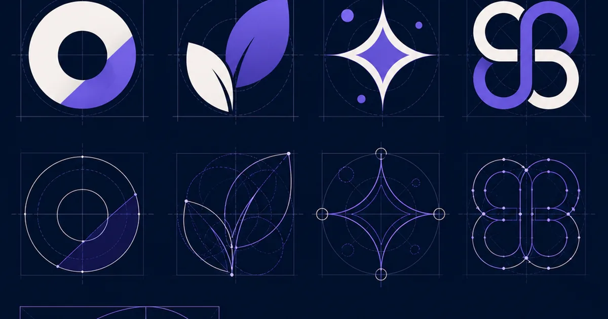
People overestimate what a logo does and underestimate what makes one good. A logo will not, on its own, build a business — but a bad one quietly undermines a good business every single day, on every invoice, sign, and screen. The logos we all recognise are not the most decorated; they are the most disciplined. Understanding why is the difference between commissioning something that lasts a decade and something you quietly redo in eighteen months.
Simplicity Is a Feature, Not a Shortcut
The most recognisable marks in the world are astonishingly simple — a swoosh, an apple, three stripes. Simplicity is not laziness; it is what lets a logo be recognised in a fraction of a second, reproduced at any size, and remembered after one glance. Complexity is the enemy of memory. When I review logo concepts, my first question is always: what can we remove? A mark you can sketch from memory is a mark that is working.
The Main Logo Types (and When to Use Them)
It helps to know the vocabulary before you brief a designer. A wordmark is the name in a distinctive typeface (think of most tech brands). A lettermark is initials, useful when the full name is long. A brandmark or icon is a symbol with no words, powerful but slow to earn recognition. A combination mark pairs a symbol with the name and is the safest choice for most young brands, because the words teach people what the symbol means.
| Type | Best for |
|---|---|
| Wordmark | Distinctive, short names |
| Lettermark | Long names, initials |
| Icon / brandmark | Established brands |
| Combination | Most new brands |
Relevance and Versatility Beat Cleverness
A memorable logo suits its brand and its audience — a law firm and a toy company should not be interchangeable. Just as important is versatility: it must work in one colour, in tiny sizes (a favicon), on dark and light backgrounds, embroidered, and printed. Designers test a mark in black and white first for exactly this reason. A logo that only looks good in full colour at large size on the website will fail everywhere else your brand actually appears.
Design for Longevity, Not Trends
Trends are tempting and they date fast; a logo redesigned every few years never accrues recognition. The marks that endure lean on timeless principles rather than the effect of the moment. Ask whether a concept will still feel right in ten years. A little restraint now saves an expensive, equity-destroying redo later — and recognition is precisely the thing you are trying to build.
DIY, Tool, or Designer?
Budget honestly shapes this decision, and all three routes can produce a usable mark. DIY in Canva or Figma works for a very early, low-stakes start. Logo tools like Looka or Hatchful generate options quickly and cheaply, fine for a first mark though rarely unique. A professional designer costs more but gives you a distinctive, properly built identity with the file formats and usage rules you will need as you grow. My advice to founders: if the logo will be on the business for years, treat it as an investment, not an expense — but do not let a perfect logo delay launching.
What to remember
- Simplicity makes a logo recognisable, scalable and memorable.
- Know the types — combination marks suit most new brands.
- Prioritise relevance and versatility over cleverness; test in black and white.
- Design for a decade, not for a trend.
- Choose DIY, a tool, or a designer based on stakes and budget — but don't stall your launch.
Questions we hear a lot
How much should a logo cost?
Anywhere from nearly free (DIY or a tool like Looka) to several thousand for a professional identity. Match the spend to how central the brand is and how long you expect the mark to last.
What makes a logo ‘timeless’?
Simplicity and restraint. Timeless logos avoid of-the-moment effects and rely on clean, relevant shapes that still read well years later.
Can I design my own logo?
Yes, especially early on, using tools like Canva, Figma, or Looka. Keep it simple and test it small and in one colour. As the brand grows, a professional can refine or rebuild it.
Why does my logo need to work in black and white?
Because it will appear in single-colour contexts — faxes, stamps, embroidery, engraving, tiny favicons. If it only works in full colour, it will break in real-world use.