Typography in Branding: How Fonts Shape How People See You
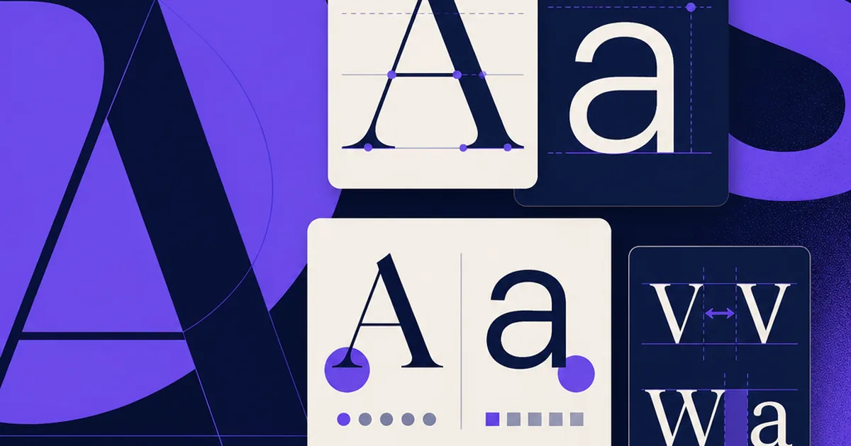
Most people never consciously notice a brand’s typography, and that is exactly the point. Type is the voice of a brand read out loud in silence. A wedding boutique set in a geometric tech sans-serif feels wrong before you can explain why; a bank set in a whimsical script loses your trust instantly. In studio work, typography is where I see the biggest gap between brands that look expensive and brands that look homemade — and it usually costs nothing to fix.
Type Carries Personality Before Words Do
A typeface communicates tone the way a tone of voice does. Serifs — the ones with little feet, like Georgia or Fraunces — tend to read as traditional, editorial, trustworthy. Geometric sans-serifs like Futura or Poppins feel modern and clean. Rounded sans-serifs feel friendly; condensed ones feel bold and urgent. None of this is a rule you must obey, but it is a set of expectations in your reader’s head, and you should choose to meet them or subvert them deliberately, never by accident.
Pairing: One for Character, One for Work
The reliable formula is two typefaces: a distinctive one for headings that carries personality, and a highly readable one for body text that gets out of the way. Contrast is what makes a pairing work — pair a serif heading with a sans body, or two fonts with clearly different proportions. Pairing two fonts that are almost-but-not-quite the same looks like a mistake. Safe, free pairings from Google Fonts include Space Grotesk with Inter, Fraunces with Work Sans, and Playfair Display with Source Sans. When in doubt, one well-chosen font used at different weights beats a clumsy pair.
Readability Is Not Optional
A beautiful typeface nobody can read is a failure. For body text, aim for roughly 16–18px on the web, a line height around 1.5–1.6, and a line length of about 60–75 characters. Avoid setting long passages in all caps, light weights on bright backgrounds, or anything that sacrifices legibility for style. I have watched conversion rates rise from nothing more than bumping body text up two pixels and loosening the line height. Comfort is a feature.
Build a Type Scale, Not Random Sizes
Amateur-looking brands set headings at whatever size looked right that day. Professional ones use a consistent scale — a small set of sizes with clear steps between them (for example 16 / 20 / 26 / 34 / 44). This creates visual rhythm and hierarchy so readers instantly know what is a heading, a subheading, and body copy. Free tools like Typescale.com generate one in seconds. Document it in your style guide so everyone uses the same rungs of the ladder.
Practical Constraints: Licensing, Loading, Fallbacks
Two things sink real-world type systems. First, licensing — a font that is free for personal use may require a paid licence for commercial or web use, so check before you build a brand on it; Google Fonts sidesteps this entirely for free. Second, performance — every custom weight you load slows the page, so limit yourself to the weights you actually use and specify a system-font fallback stack so text stays readable while the brand font loads. Type that arrives late or not at all quietly damages the experience you worked hard to design.
What to remember
- Typography sets tone before a single word is read.
- Pair a characterful heading font with a highly readable body font; contrast is key.
- Prioritise readability: ~16–18px body, 1.5–1.6 line height, 60–75 character lines.
- Use a consistent type scale, not ad-hoc sizes.
- Check licensing and limit loaded weights; always set a fallback stack.
Questions we hear a lot
How many fonts should a brand use?
Usually two — one for headings and one for body — sometimes just one used at different weights. More than three typefaces almost always makes a brand look disorganised.
Are Google Fonts good enough for a professional brand?
Absolutely. Many respected brands use them. They’re free, licensed for commercial and web use, and load quickly. A well-chosen free font beats a poorly used expensive one.
What’s the difference between a typeface and a font?
A typeface is the design (e.g. Inter); a font is a specific style and weight of it (e.g. Inter Bold 16px). In everyday use people say ‘font’ for both, and that’s fine.
Should my logo and my website use the same font?
Not necessarily. A logo often uses a custom or distinctive wordmark, while the website uses a readable system for lots of text. They should feel related in tone, not be identical.